

PowerPoint. Yum.
Don’t tell everyone, but I quite like PowerPoint. There, I said it.
There are two main types of PowerPoint files: there are true ‘presentations’ and there are ‘reports’.
Reports are often quite long with a lot of text, graphs and charts, which we can summarise to our clients on a call (but then sent to them so they can go through them at length in their own time).
True presentations, on the other hand, are shorter and snappier with fewer pages, less text and more imagery.
The following PowerPoint advice, tips and tricks apply generally to creating both types of documents.
Quick Access toolbars are where it’s at
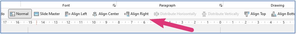
Set up your PowerPoint preferences by building a Quick Access toolbar – it’s well worth the effort. With a Quick Access toolbar setup, you can easily align items and perform other repeated actions with a single quick click.
Plus, any command that’s buried deep in the menu structure can be brought out onto the Quick Access toolbar, saving you a lengthy search.
You can do this from the right-click menu of a tool button, or you can go to File > Options > Quick Access Toolbar and set it all up in one go. Great job!

Keep your margin game strong
When it comes to laying out your content, avoid filling the page by using all the available space.
Instead, observe the natural left, right and bottom margins in your template. There’s nothing more jarring than seeing content ‘fall out’ of the bottom of the page or seeing vastly different margins.
Having white space around your content lets it breathe. Pages packed with text and graphics look and feel overwhelming.
This even applies to those reports packed with all that great insight. If you need to reorganise your content a little over more pages that’s ok, your reader will thank you for it.
Line stuff up properly
While we’re concentrating on layout, let’s get those Quick Access shortcuts into action. Find your left margin and line up everything to it. Likewise, the right edge of the graphics should align with the right margin of the page. Wide charts should be contained within your ‘working area’ – nothing upsets.
Your text should be left aligned. Fully justified text is best avoided because this leads to uneven gaps between some words as they are forced to fit to the end of the line. That column of text might ‘look’ tidier, but there’s a chance that it won’t be as easy to read.
Consistency is key (seriously)
Pick a typeface, or two maximum – one for headings, one for body copy. And better still, choose one native to Windows or Apple, so there’s more chance that whoever is viewing your file sees the same neat layout that you’ve produced, as no two fonts render with the same size or line spacing, throwing out the layout of your pages.
Limit your presentation to one icon, graphic and imagery style. A large icon set should have all you need for a single presentation or even a series. The same goes for image and graphic style: if you start using photographs, don’t switch to illustrations halfway through.
Icons are your friends
Don’t draw your own icons if you don’t have to. They take skill and precious time to get right and, anyway, someone’s already done the hard work.
Get them from here or here. They’re in vector format so you can display them at any size (proportionally, of course) without them going blurry and you can apply your brand colours to them in PowerPoint.
Quick-fire tips to achieve a professional-looking PowerPoint
- Along with the advice above, these final tips will help give your presentation a more professional feel:
- Use only your brand colours and try and limit your palette to black and two others.
- Maintain the correct aspect ratio when resizing images. If necessary, over-size and crop off an edge that isn’t crucial to the framing of the subject, or crop equally on all sides to ‘zoom’ in, taking care not to overdo it.
- The crop tool will also remove any white space your screenshots might have, allowing you to line up screenshots neatly.
- When setting out a line of logos, rather than them all being the same height or width, make them all ‘look’ the same size by resizing them so that no one or two overpower the others.
- Avoid leaving a single word on a line, or a single line at the top or bottom of a page or column. A lonely single word at the end of a paragraph creates a visual interruption in the flow that breaks the reader’s focus. A slight tweak to the width of your text block will usually do the trick. It might also be suitable to introduce a hard line break by using Shift + Enter on one or two words in on the line above to push those words down beside that lonely single word.
- Avoid spanning text the full width of a page. More than about 12 words per line is difficult to read. You can split your text into columns.
- Avoid tight line spacing. Go for about 120-140% of the type size depending on the typeface.
- If you create your own PowerPoint templates, you can add tips and tricks for your colleagues on the last pages in ‘Master Slides’.
Nifty keyboard shortcuts
- Use Ctrl + Shift + Alt to resize elements in position
- F5 will start slideshow from the start
- Shift + F5 will start slideshow from the current slide
- ESC to leave slideshow
- Windows + Shift + right or left arrow will move the presentation between screens. (You’ll never remember that when you need it, by the way!)
Coast Digital’s design services
For what it’s worth, we know about more than just PowerPoint.
For those seeking professional website design services, Coast Digital has got you covered. With our expertise in creating visually stunning and user-friendly websites, we can help you make a lasting digital impression.
Give us a shout if you’d like to chat.